In this project, I:
- Helped develop and implement a modern, versatile design system for use across the entire NETGEAR consumer experience
- Designed a simple, user-centered single sign-on flow
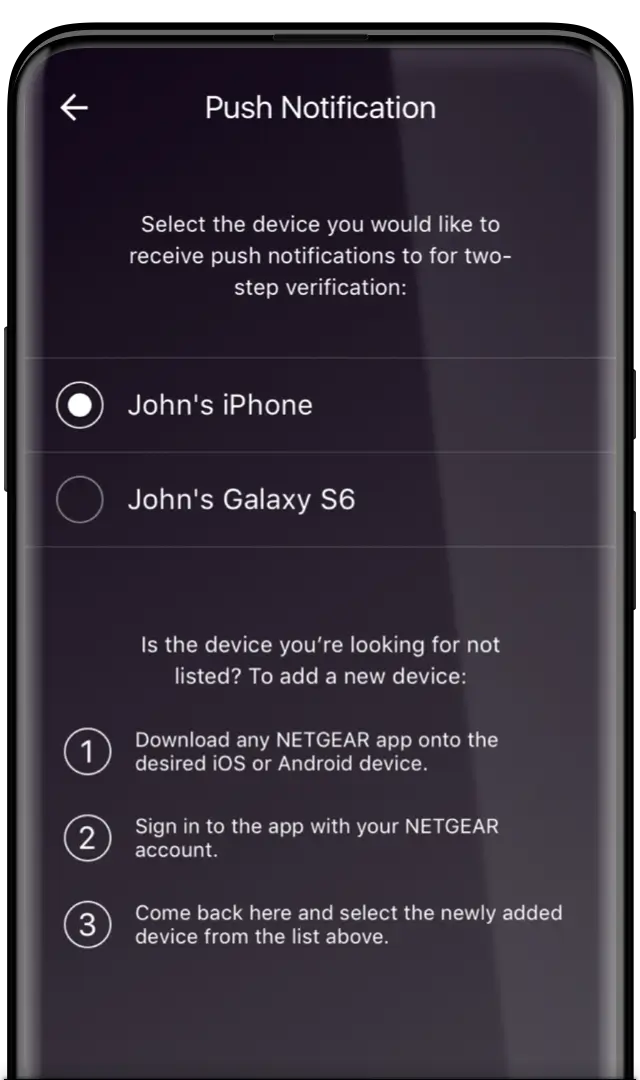
- Worked with engineers to create an effortless notification-based two-step verification (2SV) system
- Created usage guidelines and documentation for the new design system to ensure consistent, high-quality implementation
- Prototyped the next generation of apps for NETGEAR’s consumer routers
NETGEAR came to us in 2016 with a problem: their smart home hardware was becoming best in class, but the related software? Not so much. With a fragmented and outdated experience across their different product lines and sub-brands, they needed an experiential reinvention to truly contend with the rest of the connected home players.
The work shown here was part of an initiative named OneCloud, which aimed to bring all the disparate experiences for each product line into one unified front-end. While some of the work below was conceptual or never made it to production, much of this lives on as the core of NETGEAR’s UX/UI.
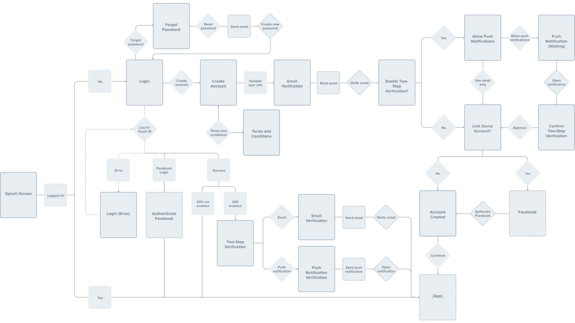
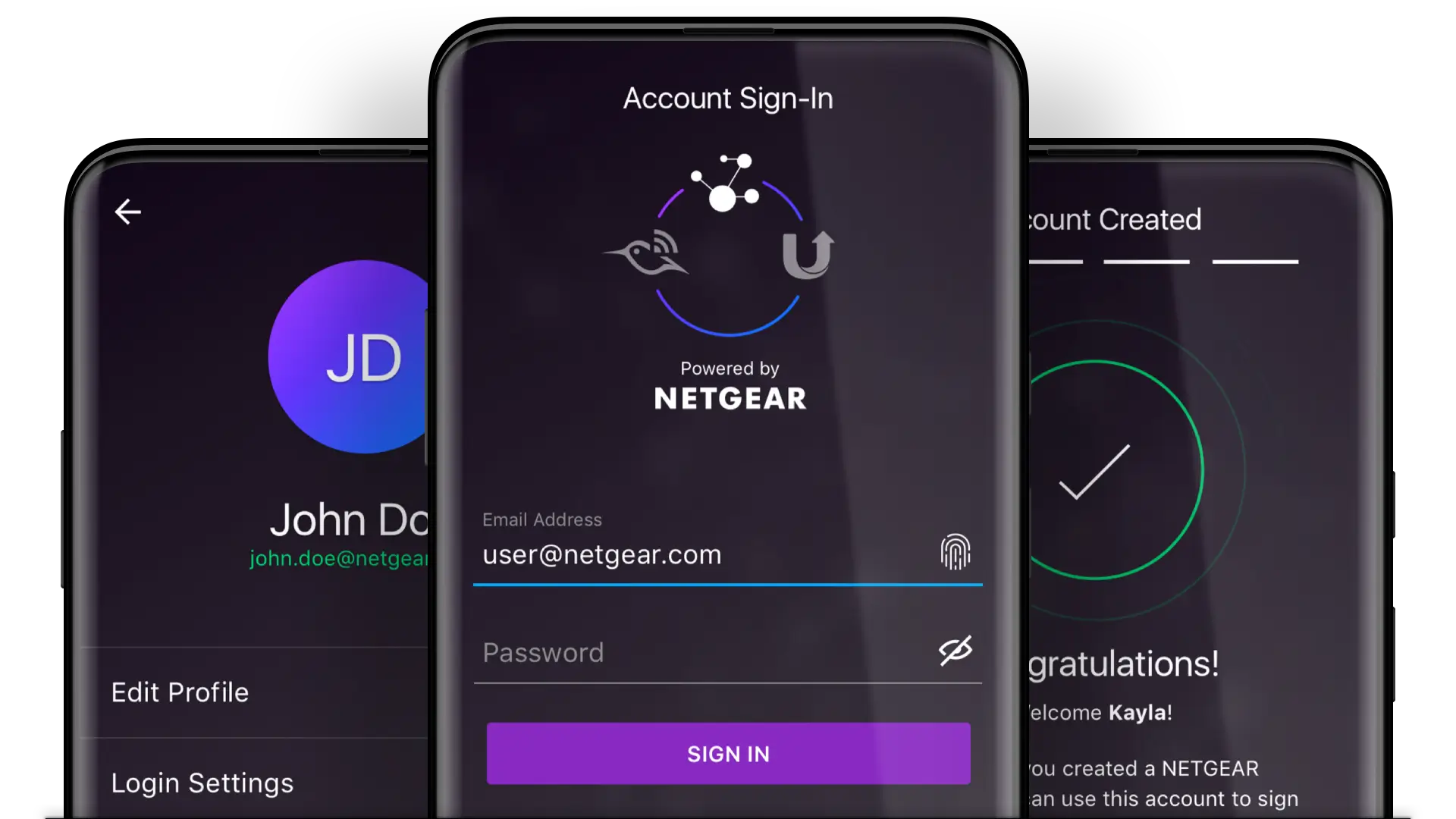
Our exploration began with single sign-on — creating one singular login flow for all NETGEAR products. To begin, I drafted a completely new signup and login flow, which also introduced two-step verification to the login process for added security. We also pushed hard for using innovative (at the time) OS-based authentication methods such as Touch ID.

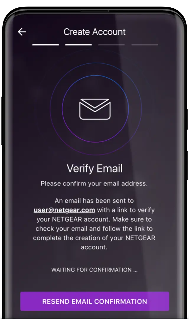
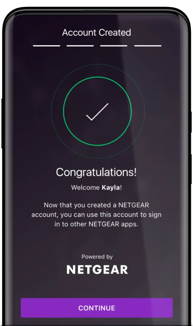
The proposed UI introduced a new design language crafted specifically to modernize and sophisticate NETGEAR’s digital image. The brand purple served as an anchor, while simple-but-sleek illustrations and subtle animation brought the experience to the next level. The new style also relied on a darker but starker color palette, addressing many of the accessibility concerns with the brand’s previous designs.
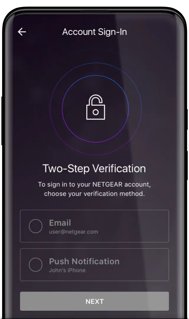
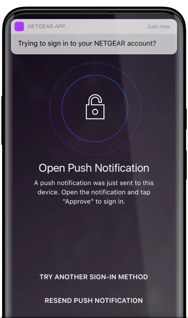
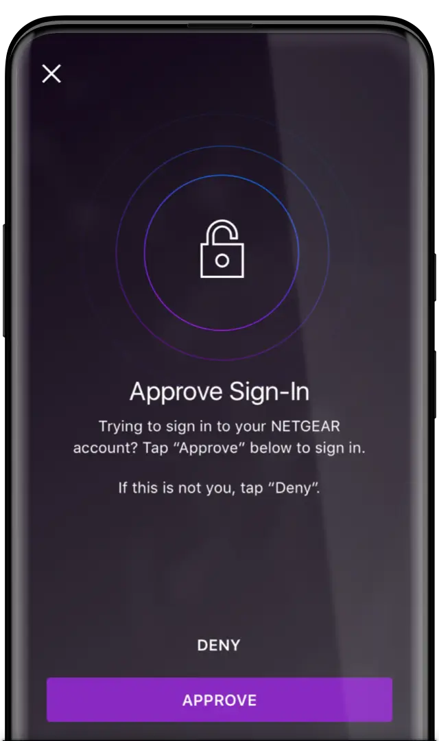
Interface wasn’t only thing getting our attention, though — we worked diligently with NETGEAR’s engineering team to craft a thoughtful (but technically feasible) two-step verification process. Plainly put, a feature like this takes a lot of work to ensure it remains secure but easy to use. Our method included a push notification-based verification method, which is one of the simplest and most user-friendly methods of 2SV (critical for adoption at a time when 2SV was just gaining traction).
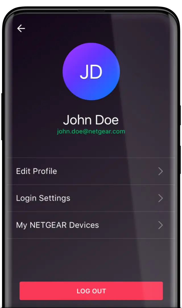
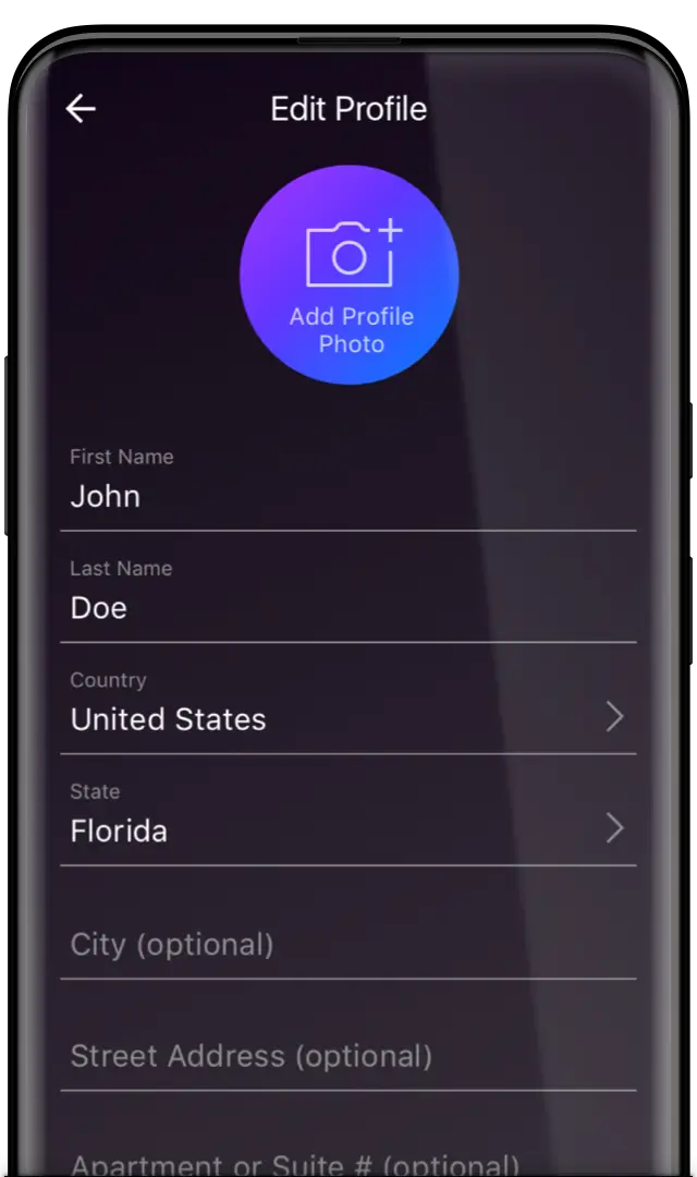
The OneCloud work also included a new, unified account across all NETGEAR products. As such, we designed a simple profile view that could be integrated into any NETGEAR app and still feel at home.
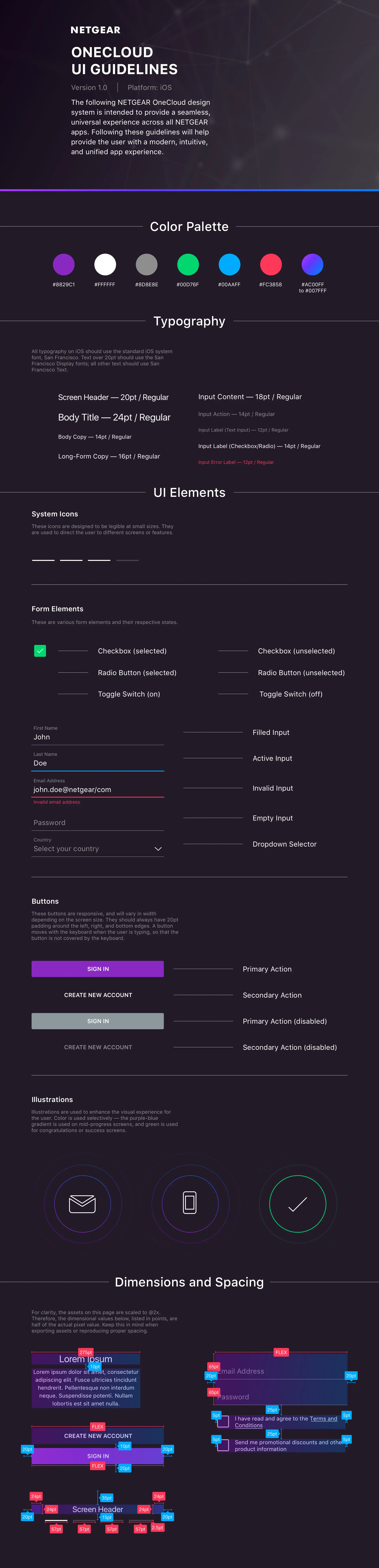
Eventually, this new design language was approved and rolled out as NETGEAR’s official new UI system. With that came documentation. Lots of it.
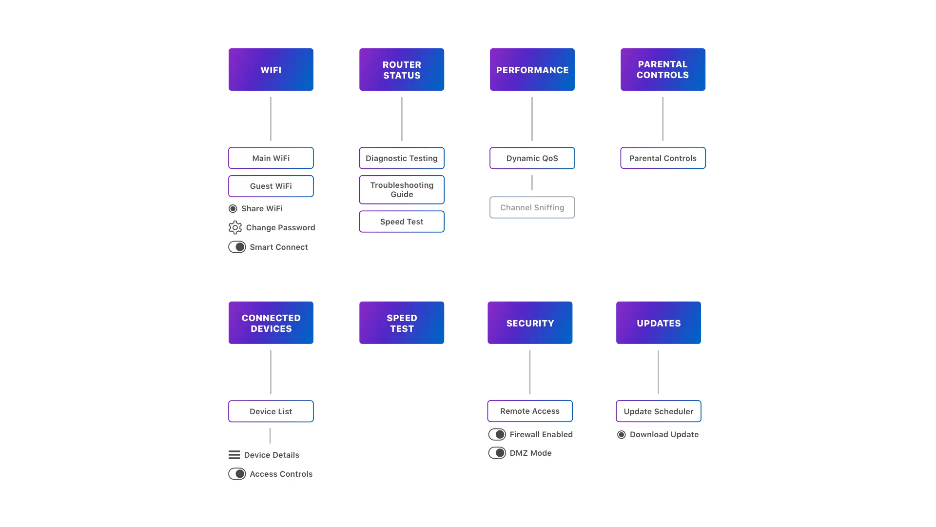
This work also led to exploration of a new router management app for all NETGEAR routers (one of their key products). In this work, we collaborated with the NETGEAR product management teams to identify what features should live in the app, and then organized them in a way that non-technical end users would know how to navigate.
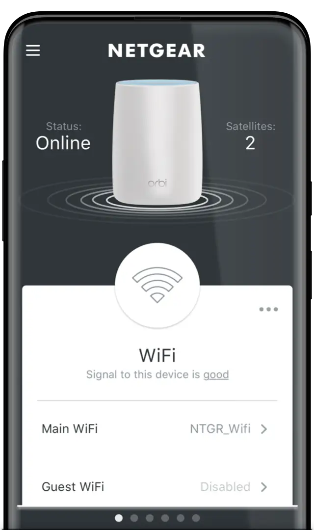
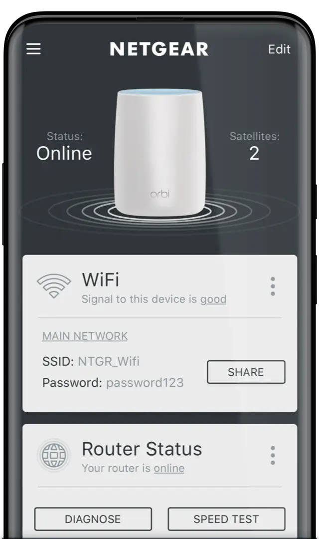
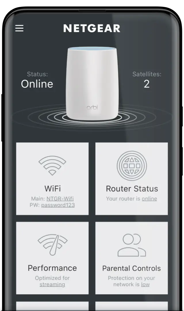
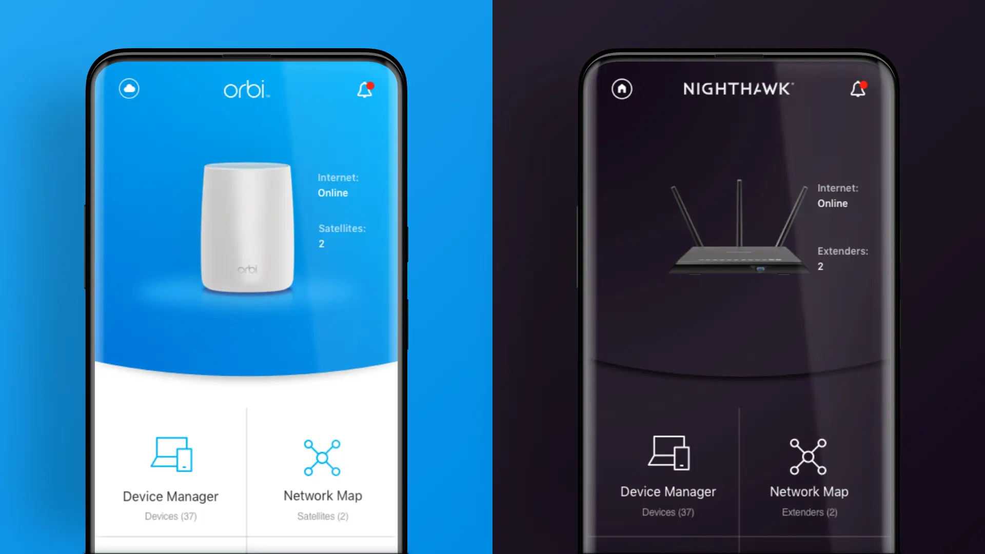
From there, I got to work re-imagining what this management interface could look like (focusing mostly on wireframing functionality at this stage, so as not to get tripped up on design semantics). I segmented the feature “buckets” into cards, and explored multiple ways to arrange those features in an easy-to-use, gesture-driven interface. The grid-based option is what eventually prevailed — as seen in the current Orbi and Nighthawk apps in the App Store.
While the full OneCloud initiative didn’t make it through to a complete rollout, the work itself proved an invaluable step for NETGEAR. What was before a staunchly engineering-led organization now considers design equally as important to the experience of its products. For a company of NETGEAR’s scale, this was a pivotal transformation necessary for their continued success — and an initiative I was proud to play a part in.