In this project, I:
- Designed a new, user-centered site architecture for this 500+ page website that actually made navigation simple and effortless
- Created a fully responsive, modular component system that would be used to construct almost the entirety of the final site
- Used this component library to design key landing pages of the website, while creating content guidelines for the client to populate the rest
- Designed — and collaborated with multiple technical partners to execute — an interactive mall directory feature within the site
- Worked tirelessly with the development team to ensure site passed QA standards, SEO best practices, and accessibility guidelines
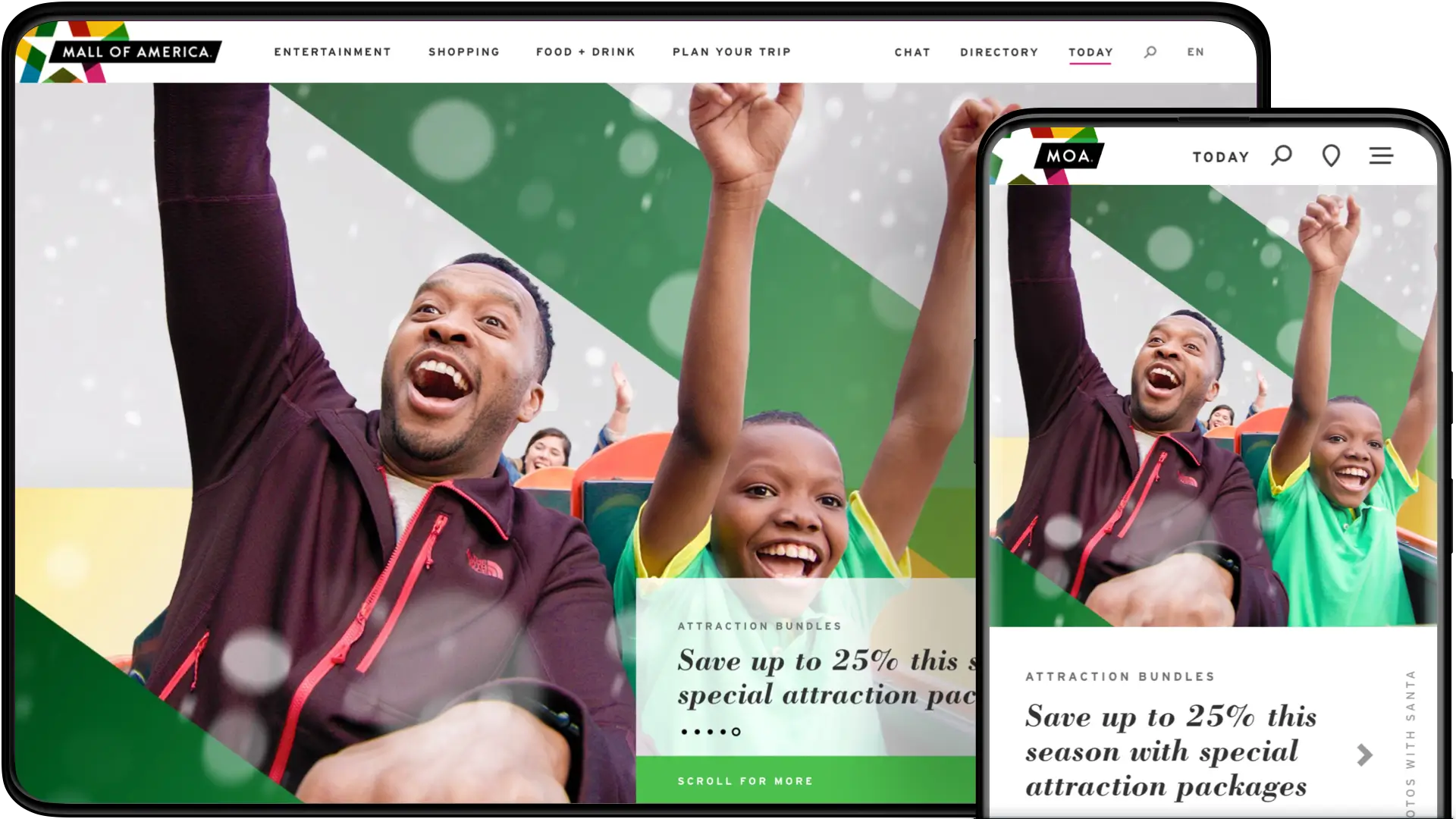
As the Mall of America rolled out the red carpet to celebrate their 25th anniversary, they recognized the need to revisit their most important digital asset — their website. With over 40 million visitors to the Mall yearly, the website itself is no stranger to company. It serves as a resource for tourists, shoppers, families, job hunters, neighbors, and more. But the current website just wasn’t cutting it; MOA needed a web presence to match the vivacity and joy of its in-person experience.
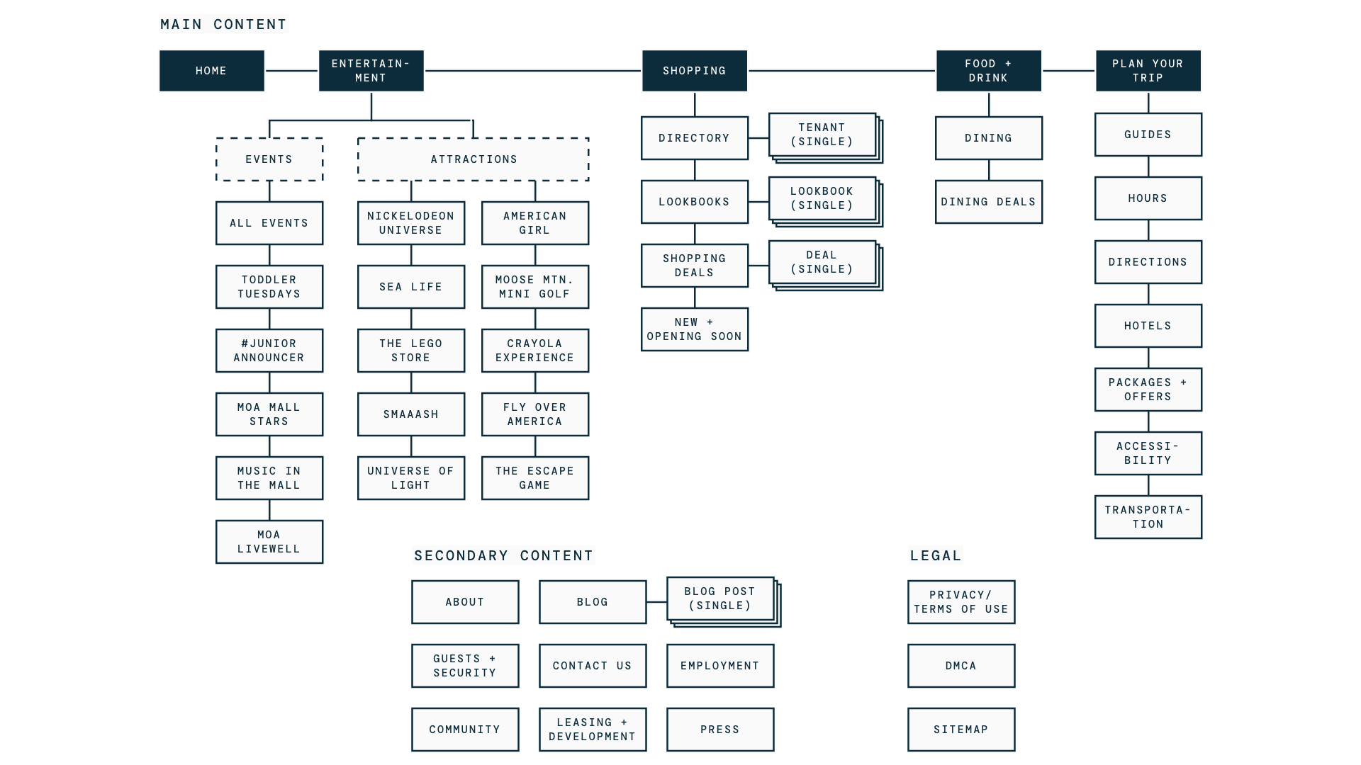
After a comprehensive audit of their current experience, I went to work architecting the new website. The new sitemap was built with a stronger focus on user-based navigation — that is, structuring the site in a way that better reflects what users are thinking and looking for. This meant categorizing the site’s content into the major reasons visitors come to MOA (Entertainment, Shopping, Food & Drink), as well as a section dedicated to planning the overall experience (Plan Your Trip).
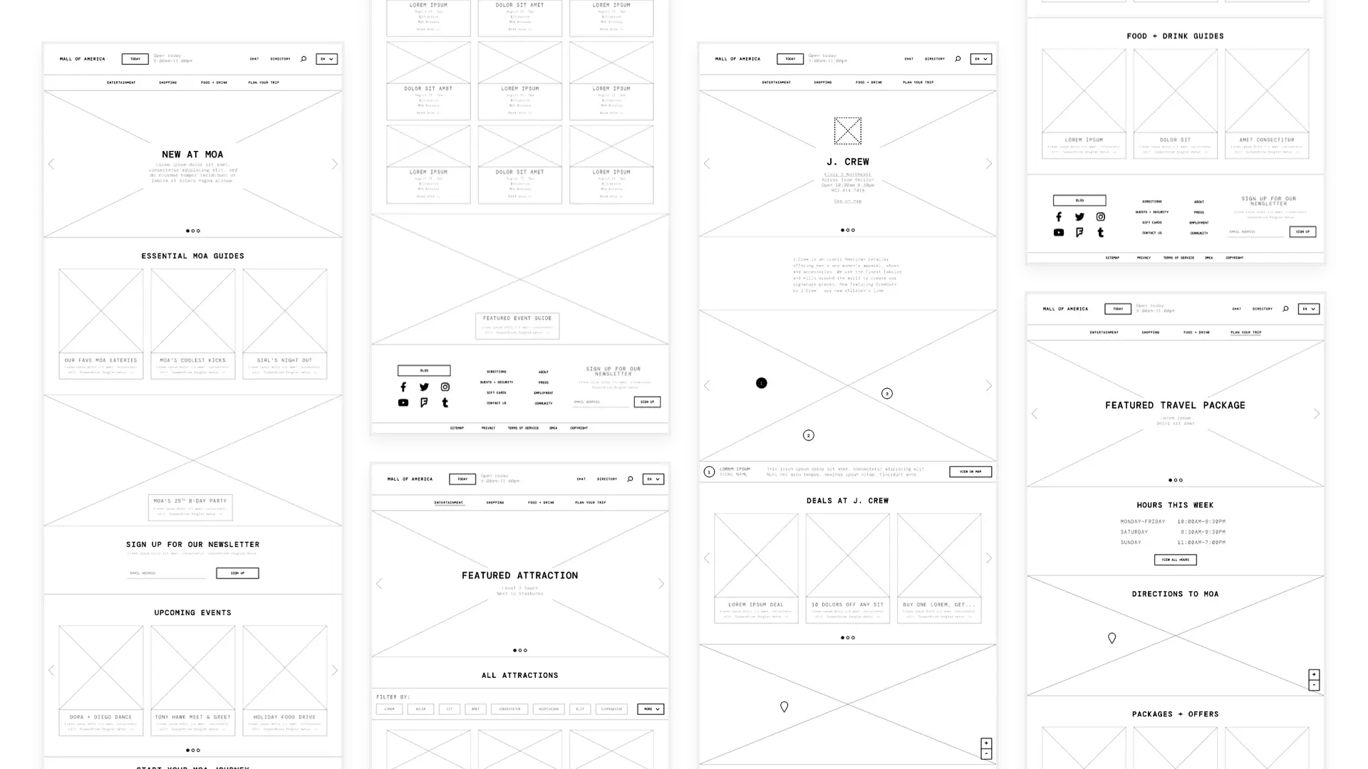
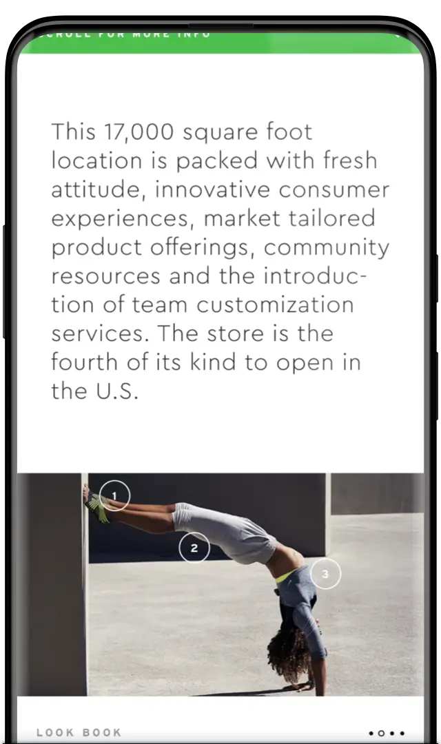
Next came a comprehensive UX phase in which I created wireframes for the primary pages of the site. This allowed us to explore all the different content blocks, or modules, that would be needed in building the site.
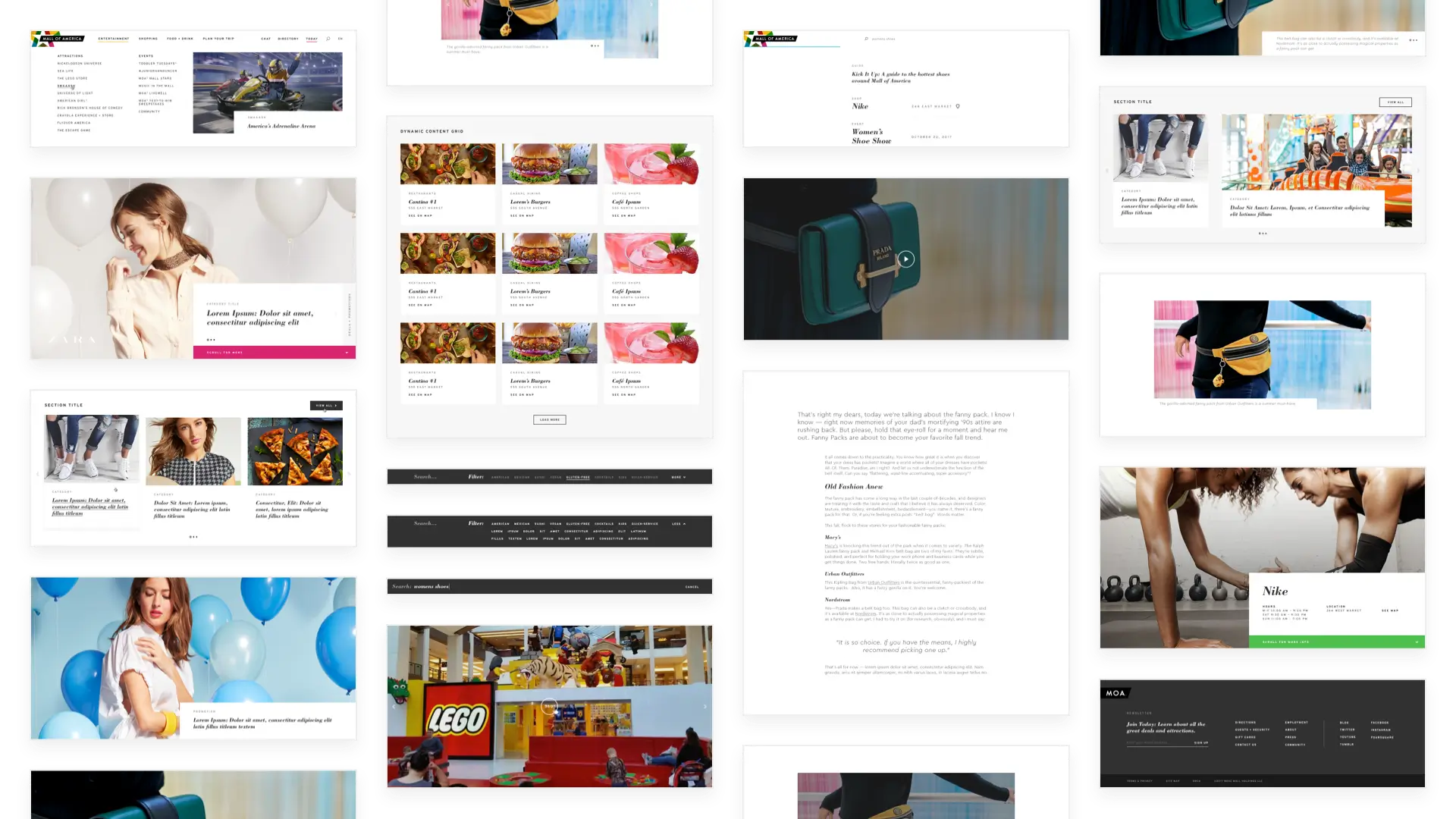
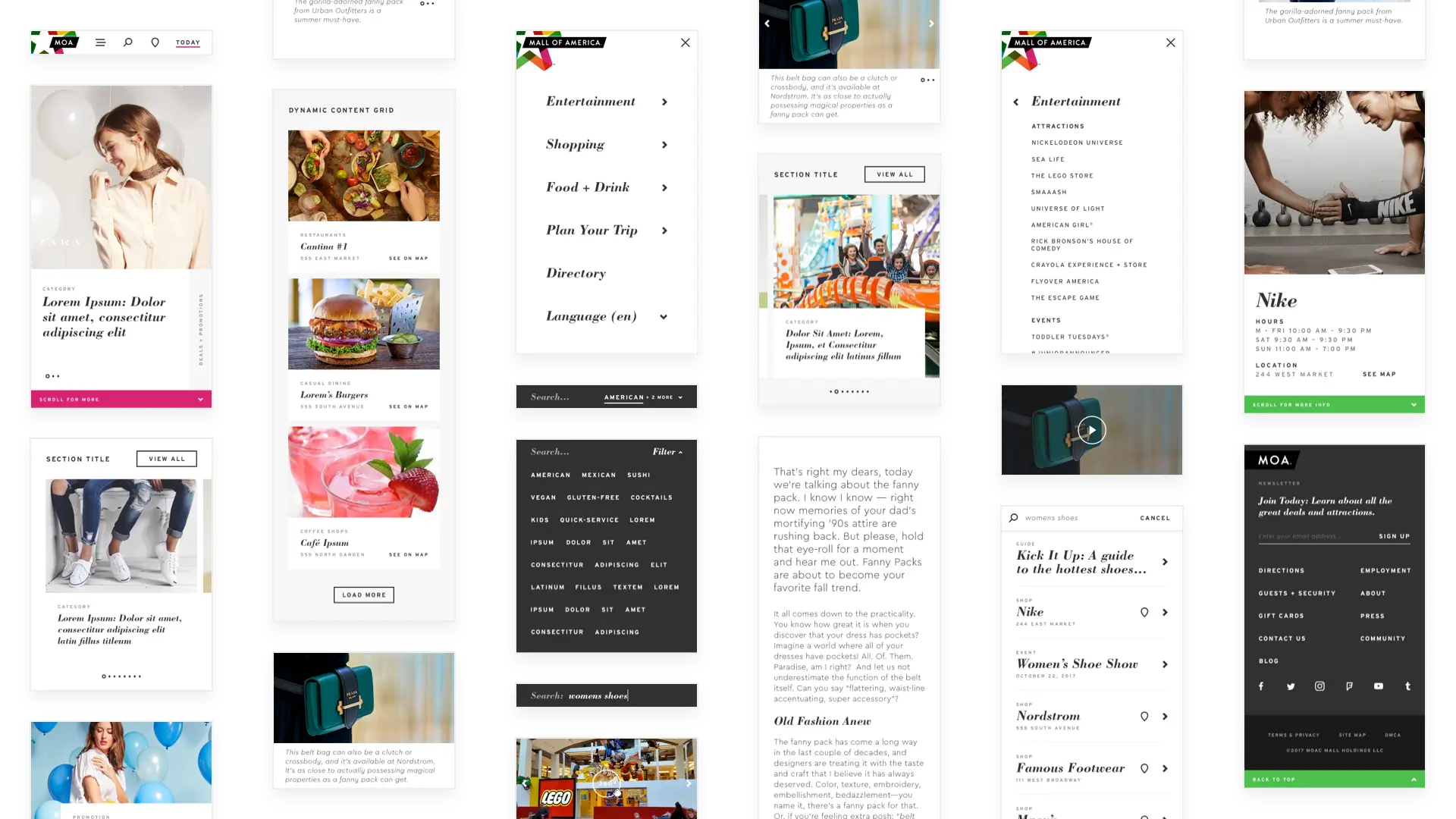
Out of this was born our extensive module library, which allowed for efficient and organized construction of the site’s 500+ pages. Each module was meticulously crafted and exhaustively tested to work in combination with any other module, across every device type, and to be fully accessible to any visitor.
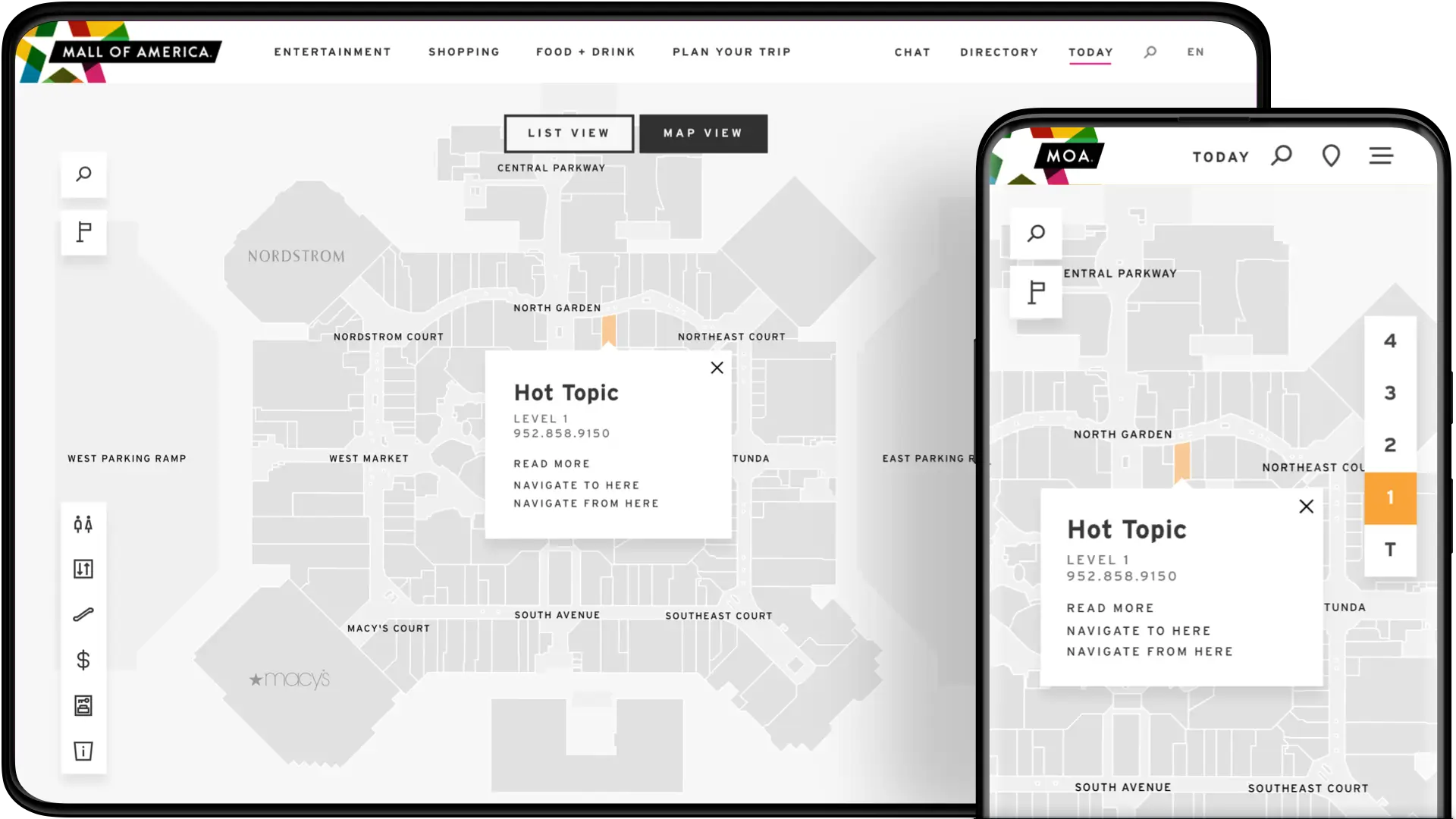
Of particular complexity was the directory module, a web app within the site that lets visitors survey the expansive layout of the Mall. We also went beyond the brief to create a navigational feature within the app, which allows users to map the best route between the destinations on their itinerary. The directory was a product of collaboration with multiple different technical partners, whom we worked closely with to create a smooth and seamless experience.
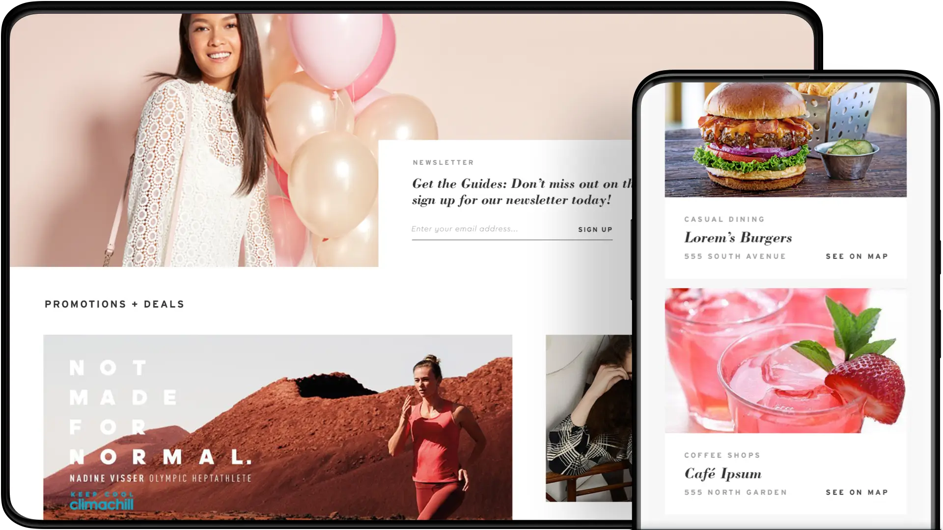
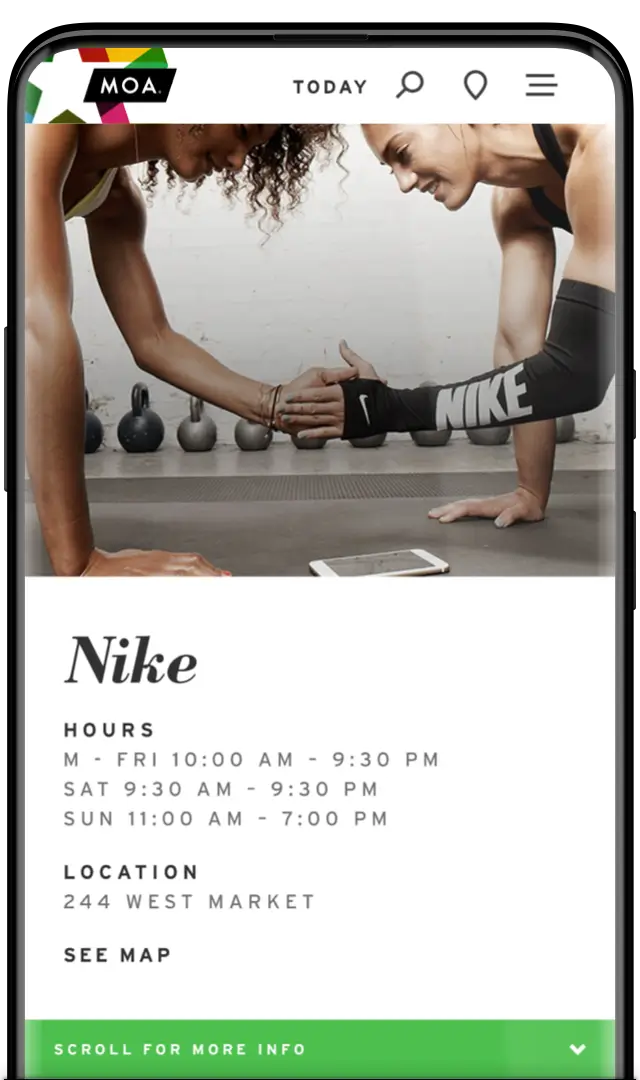
All of these modules came together to create visually rich and captivating pages that put the Mall’s wide range of offerings on display. From events to attractions, stores to restaurants, and editorial content that showed unique angles of the Mall, the new website delivered on its aspirational vision.

Note: While much of the website remains true to this original design + design system, you may notice the site looks a little different than what you see above. These updates were undertaken by the Mall internally after the launch of the initial redesign, and I can't claim credit for any of this work.