In this project, I:
- Developed the digitization strategy for a previously print-based health curriculum
- Conducted user research to help define pain points/problems to be solved
- Led the UX team in creating comprehensive wireframes of the new platform interface, as well as documentation for the backend system structure
- Collaborated with our design team to bring the interface to life
- Worked thoroughly with an external development team to ensure seamless, functional and fully accessible implementation of our designs
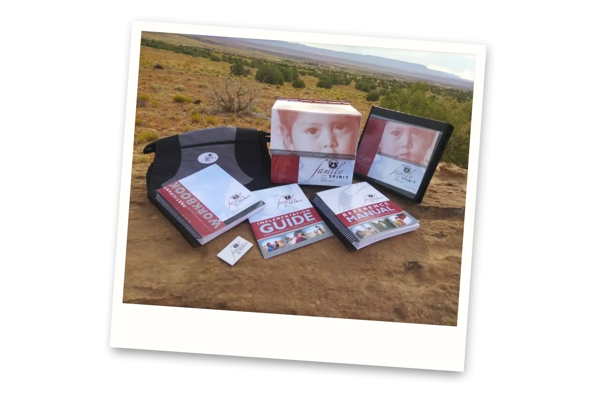
Our partners at the Johns Hopkins Center for Indigenous Health had a big problem in 2020: delivery of their Family Spirit early childhood intervention program was disrupted by the COVID-19 pandemic. This program, which usually had health educators visiting the homes of families and teaching from printed materials, was forced to find a way to go virtual in order to continue operating.
They came to our team with a question: how can we digitize the current program, in a way that maintains the core curriculum but translates it appropriately for a totally new format?
The first step to designing this new digital program was user research — in this case, speaking with the health educators that would be teaching through the new online platform. In these discussions, we learned valuable information such as:
- The pain points of the existing materials;
- Outreach issues educators had been having in the first few months of the pandemic;
- and access barriers that may prevent adoption of this new platform.
Of primary concern was the limited internet access prevalent in many of the rural/reservation communities where the Family Spirit program is used. We quickly learned that whatever we built had to be fast, light, and work fully offline if it were to serve the program participants and educators well.
So from there, I built out the strategic foundation of the new platform, centered on five main principles:
- Build for families first (they’re the most important end user)
- Go beyond the lesson (allow participants to use and explore the platform in other ways than just lessons with their educator)
- Flex with the context (allow for different presentation modes, such as remote or in-person, depending on the situation)
- Build for accessibility (design with intention to include participants of all physical, educational, and technical abilities)
- Keep it culturally relevant (ensure users see themselves represented by the platform, for increased trust and resonance)
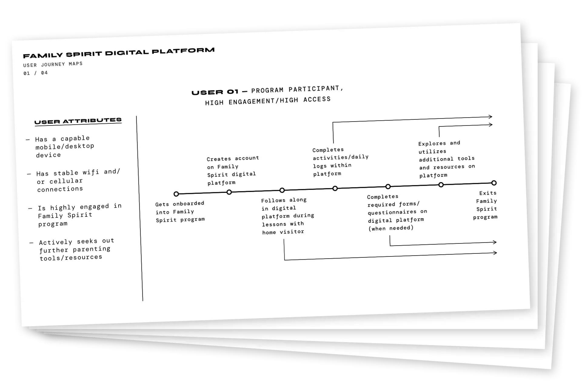
I also created user journey maps to represent the different journeys the audiences of this tool might take, and the nuances of each type of user. These maps were intentionally straightforward, with no muddying fake personas or elaborate backstories — just a clear look at who we’re building for, and how we can best serve them.

Next came an extensive set of wireframes, meant to define how the interface would work and how content was connected across the application. I led our UX team in the execution of these wires, while also working collaboratively with our development partners to make sure everything lined up with what they were building. Because of the urgent need for this platform amid the ongoing pandemic, we had to build fast and work nimbly — so backend development was already underway once these wireframes were in progress.
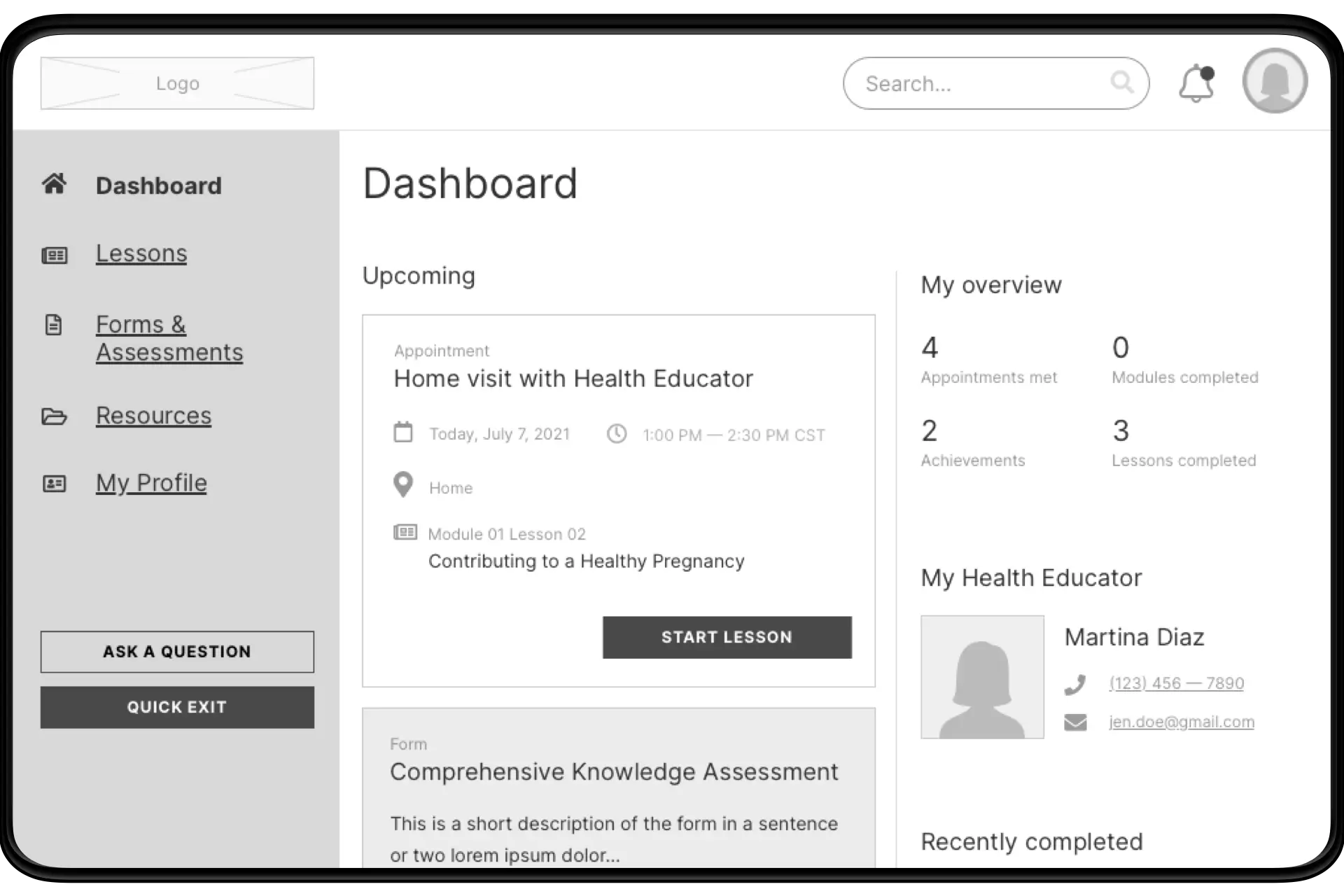
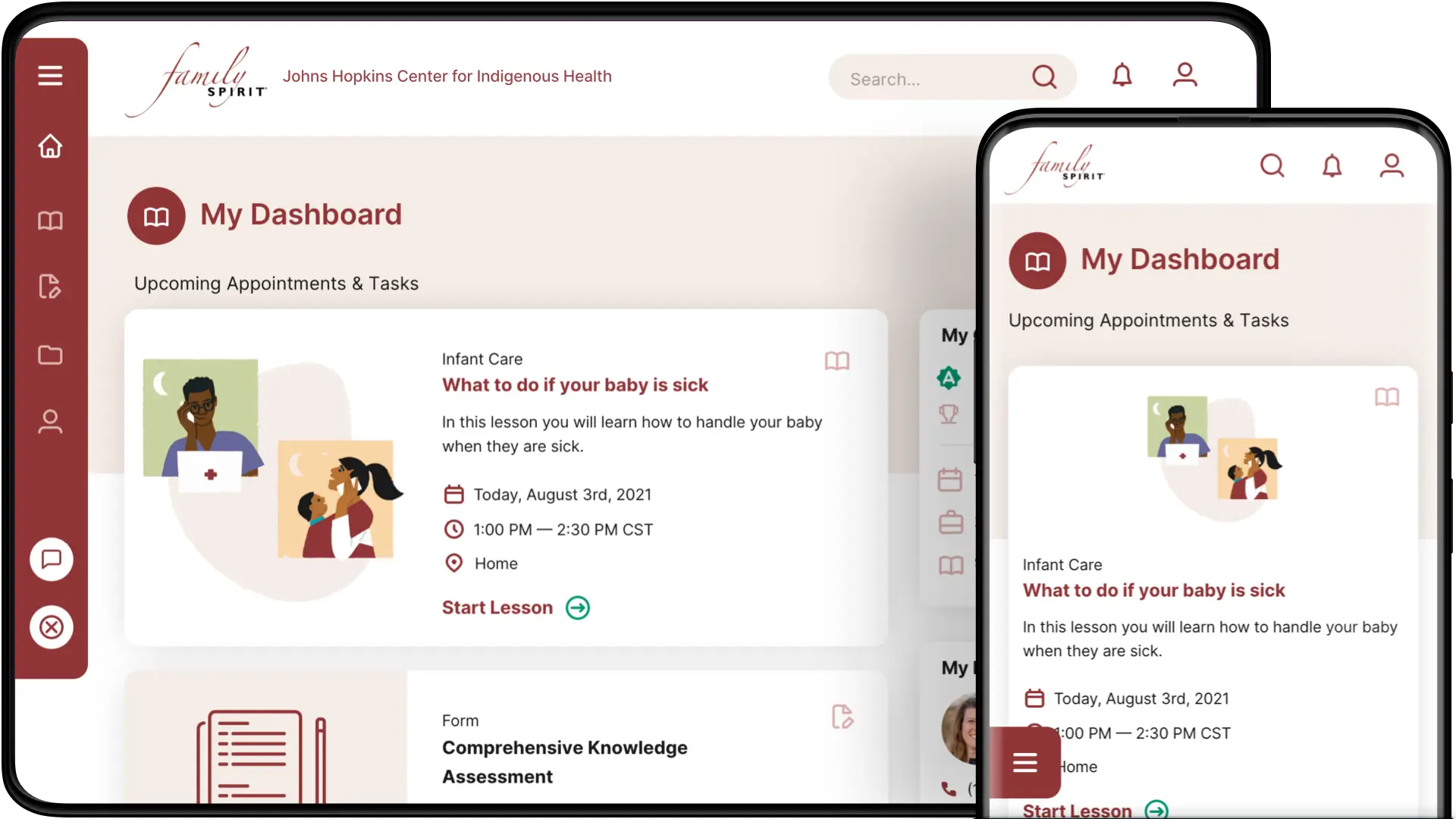
The main view of the application is the Dashboard, a screen that surfaces everything a user might need to quickly reference in one place. Their upcoming lessons, any assignments, contact info for their health educator, and an overview of their progress are all easily visible and accessible.
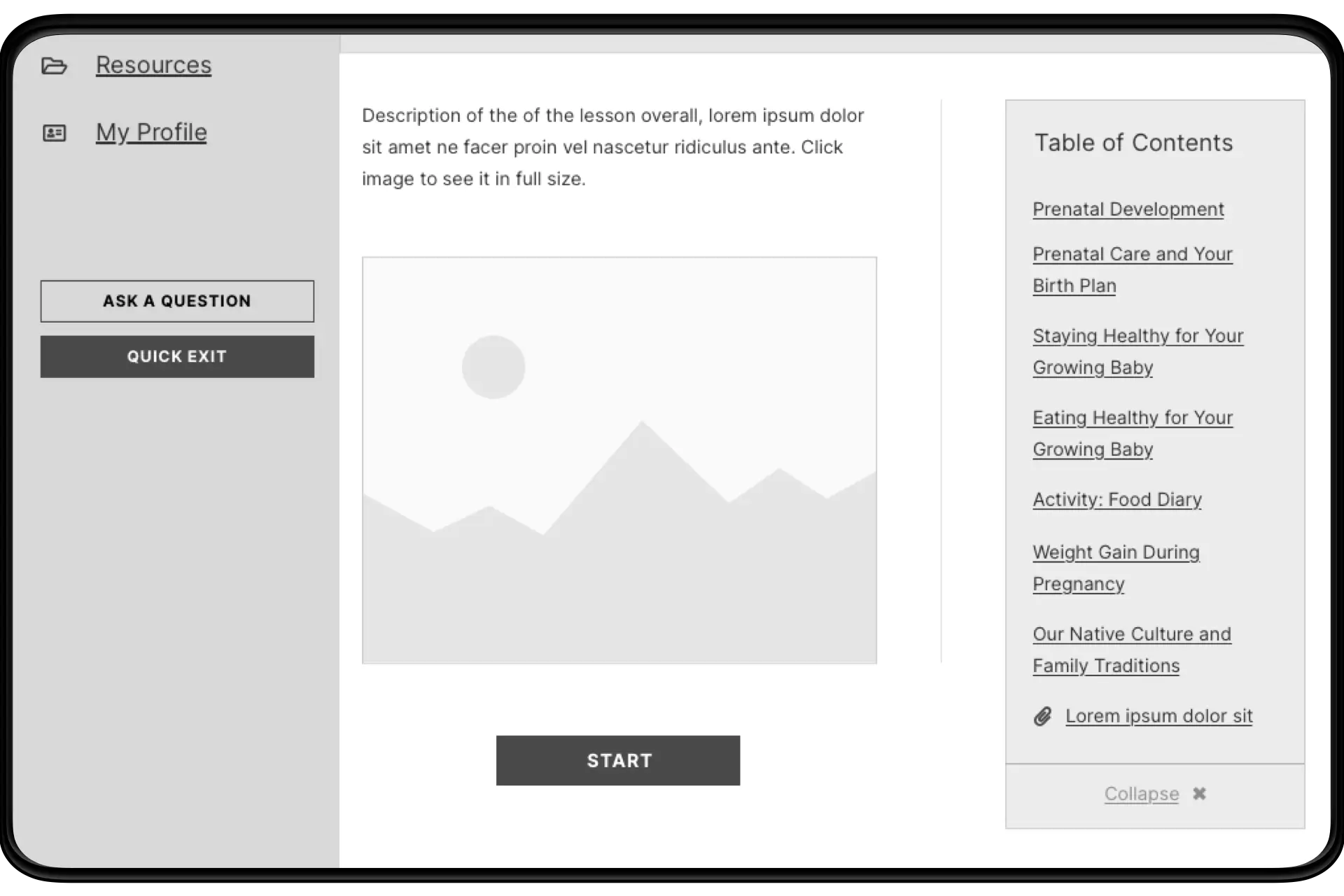
Once inside a lesson itself, the participant is presented with information in small, digestible amounts, with each lesson broken up into many pages (making it easier for the educator to go through it with them one step at a time). And whereas previously participants had a separate workbook for activities and forms to complete, those activities could now be incorporated directly into the relevant lesson and conducted digitally.
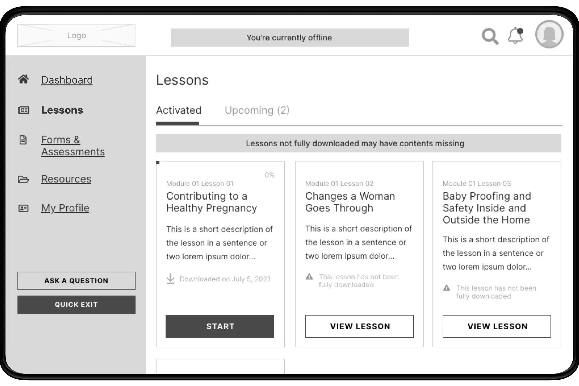
As we found in our original research, online connectivity is a huge issue in many of the areas where this program is utilized. We not only designed comprehensive offline functionality into the tool (which was built as a progressive web app for this purpose), we also created the ability to download curriculum content ahead of time — so a participant could access the app online, and store any or all of their upcoming lessons locally. This way, they could participate during sessions (sometimes conducted via phone because of these network limitations) and use the app as if it were fully online, rich media and all.
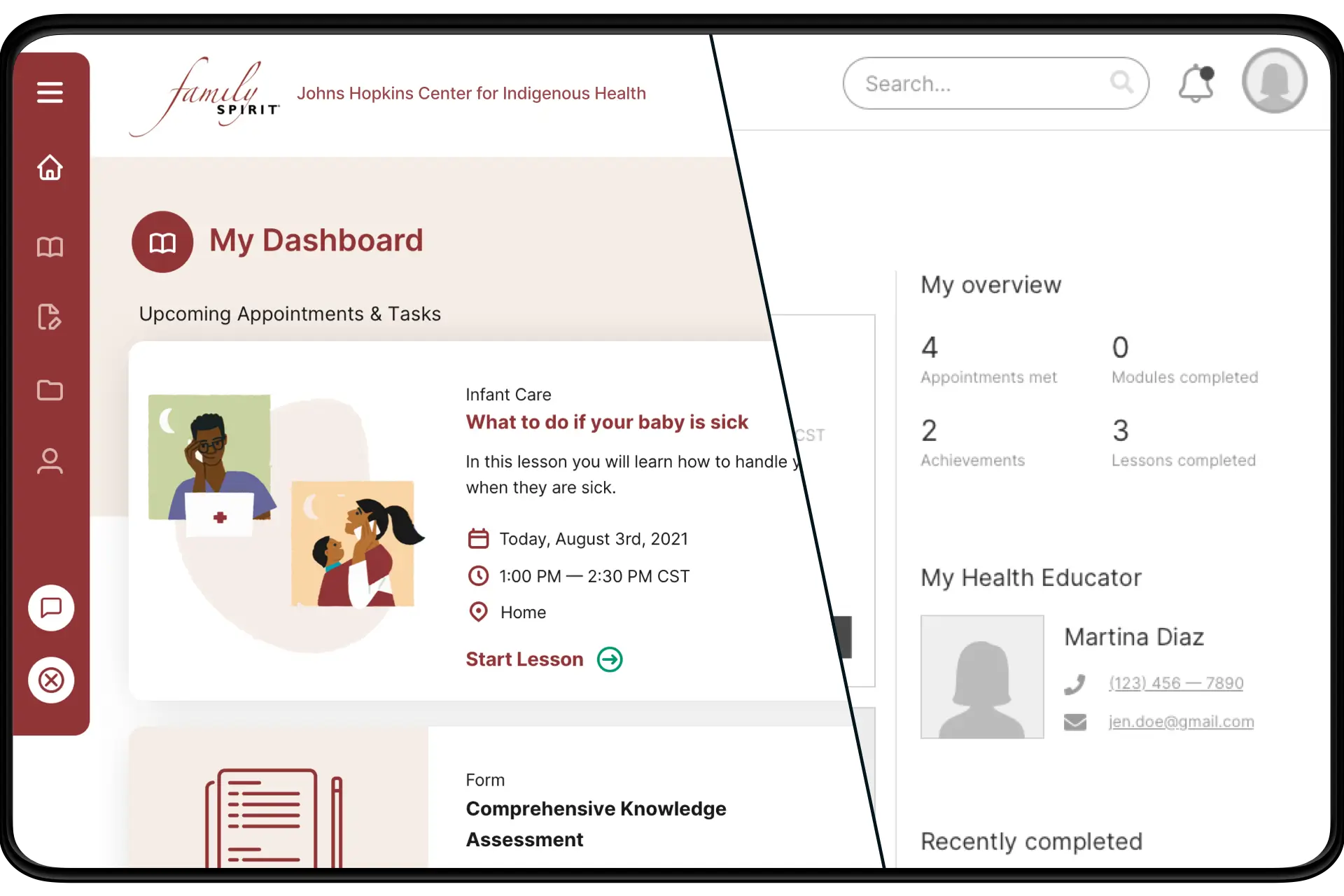
While wireframes were underway, our visual design team was hard at work figuring out the look and feel for the application. Once both were approved, we were able to work as a hybrid UX/design team to bring the interface to life. Because of the hybrid nature of our designers, the best practices and UX intentions of the wireframes carried over to the final design seamlessly — while also allowing for creative exploration and interpretation where it made the most impact.
After an intensive development cycle and extensive QA, the new Family Spirit platform was ready to be put to the test. We rolled the product out to a select group of health educators, who would test the platform with their participant families. This initial beta provided invaluable feedback and insight that we were able to use in quick iterative development sprints before a larger rollout. Overall, the digitized platform was an instant success — health educators lauded the ease of use and ability to manage clients all in one place, and participants appreciated the accessibility of the content. 👩👩👧
Props to Yunha Seo for the incredible wireframing + design work, as well as Anders Holine for his visual design direction. Development was done with our awesome partners at Pixelsmith.